New York City Vehicle Collision Analysis
June 11, 2016
Abstract
Vehicle Collisions and Traffic related fatalities are a serious problem for major metropolitan cities. The city administration bodies spend quite a lot of taxpayer’s money to implement prudent solutions. New York City Administration is making data-driven[1] decisions to tackle this problem. In my research report I will introduce you to the most dangerous intersections in NYC, contributing factors in these collisions and will see how efficient the NYC administrations efforts are towards reducing traffic related fatalities.
Introduction
Driving in New York City is known to be punishing on the driver and is a driver’s nightmare. The city also records a very high number of vehicle collisions on a daily basis. This can be attributed partially to high volume of vehicles that ply the road and also to the nature of roads which have a lot of intersections. New York City has been the leader in the Open Data Revolution and has passed Local Law 11 in 2012[10] under which city agencies had to make datasets like Vehicle Collision Information publicly available. In 2015 the Mayor of New York shared the ‘Open Data for All’ [1] program under which New Yorkers do have access to information about the vehicle collision data for all the five boroughs in the City. For my Term Project, I am going to use the Vehicle Collision Data available on NYC Open Data Portal [2] to identify locations and intersections that are more prone to accidents by identifying the ‘hotspots’.
Relevant Work
Since the efforts of the NYC Mayors Bloomberg and De Blasio to make civic data public, city agencies in NYC are now releasing datasets every month, which is now readily available for public consumption. Open Data Enthusiasts with association of Socrata have provided us with Open Data Portals like NYC Open Data where this data feed from city agencies in unfriendly formats is normalized and available in all possible formats for download. Data Enthusiasts like Ben Wellington [3] have shared their discoveries about the Vehicle Collisions in NYC and how they affect the cyclist in the city. Also there has been considerable research on the Pedestrians deaths caused by these collisions. One such paper describes the quandary faced by older pedestrians [4] and explains why majority of the pedestrian deaths caused during motor vehicle crashes are New Yorkers above the age of 65. NYC Department of Transportation has been dedicatedly working on creating more data driven decisions to make the NYC streets much safer and reduce the number of deaths and fatalities. In fact, as per the recent NYC Department Of Transportation report 2015 has been the safest year yet [5]. This was done by identifying the crash prone areas and taking appropriate steps these intersections and streets safer.
Challenges Faced
The first and foremost challenge was getting the data from the city agencies. Even after the Open Data Policy was adopted by NYC Administration, the data was not available in machine readable format. Ben Wellington, Data scientist and assistant professor at Pratt University talks [11] about how NYPD released PDF reports every month which implied anyone who wanted to use that data had to convert it into a machine readable format, an overhead [14] with every single PDF release. NYC Crash Data Band-Aid [12] was an effort from John Krauss to automatically scrape this data (in PDF format) and make it available to the public. Later last year the De Blasio Administration signed the Open Data Legislation [13] which implied city agencies to provide data in machine readable format. This information is now available as a daily feed to the NYC Open Data Portal.
Issues with Data
The data is only as good as provided by the Transport and Accident Management System updated by the NYPD. This presents the most important issue of pseudo approximate location data. It alludes that a particular crash incident location information is mapped to the nearest intersections and the location coordinates may not always represent the actual location of the crash [6]. Hence this assumption needs to be accommodated when considering the results of, which is the most dangerous intersection or, which street is the least safe one. Another challenge is, as there is quite a lot of information that is not geocoded (15%), thus the exact location of crash is unknown. This adds quite a bit of skew to our statistical analysis and over time it might widen this gap. In cases where collisions have happened in the middle of the street between two intersections, the decision on which intersection that data will be mapped too is totally dependent on the NYPD officer that reported the accident. Thus no information on the agreed tie-breaker has been provided. Unspecified data for the Contributing Factors for multiple records affects the efficacy in finding the cause of a majority of the vehicle collision information.
Data Pre-Processing
The data is available from July 2012 till March 2016. The data is structured pretty
well with small glitches in the geo data provided, courtesy NYC Open Data Portal Team.
However, there is quite a lot of important information missing out of the 769050 records.
Below table is a summary of the same. Table 1: List of Missing Columns and the Percentage of Missing Data in Them. Data Source: NYC Open Data[2]
| Column Name | Missing Information % |
|---|---|
| LOCATION | 15.75 % ( 121185 records ) |
| BOROUGH | 23.96 % ( 184299 records ) |
| STREET NAME | 14.77 % ( 113618 records ) |
| CONTRIBUTING FACTORS | 52.49152 % (401995 records ) |
The records missing the Location values are not useful as they fail to identify the critical information about the location of the crash, which is paramount to us. Thus the records missing location information were thrown out. The missing Borough and Street Names details were not reverse geocoded from Google Maps API due to the limitations enforced by the tools used to do limited number of API calls [14]. The Contributing factors attribute consists of some vital information about what according the investigating officer were the reasons for the crash that has occurred. As most of the information is listed “Unspecified” this will limit our ability to provide analysis about the possible reasons of the crash and pointing out the appropriate precautions to make the intersection safe. I have not removed this information to calculate the statistics, but filtered them out while displaying the visualizations. Finally, all the information available here is for the ‘reported crashes’ where an NYPD officer was present to fill up this information, in their Traffic and Accident Management System. This is required mostly in instances when insurance needs to be claimed for a collision by the victims. All crashes that were not reported and the one’s that occurred before July 2012 are not present in this dataset. R Studio [16] will help me perform this pre-processing task and visualizations.
Visualization
I will be using the libraries in R[17] that will help me out to give clear visualization of the results. Below are some of the tools, which I will be playing with to provide the best visualization of such spatial data.
ggmap : special visualization package in R that provides maps for spatial data. The maps were overlaid with layers using stat_density2d[28] package and geom_points [29] for appropriate plotting and contouring. grid package was used to arrange multiple plots next to for visualization
Distance Metrics
As the data points here in consideration are the location values represented in Latitude, Longitude format, we can calculate the shortest distance between these crash points and find inherent clusters of such crash sites which are closest to each other. Euclidean distance seems to be a better distance metric as it can compute the shortest distance efficiently in two dimensional Euclidean space. Hence I will be using Euclidean distance while performing clustering on the current dataset.
Analysis
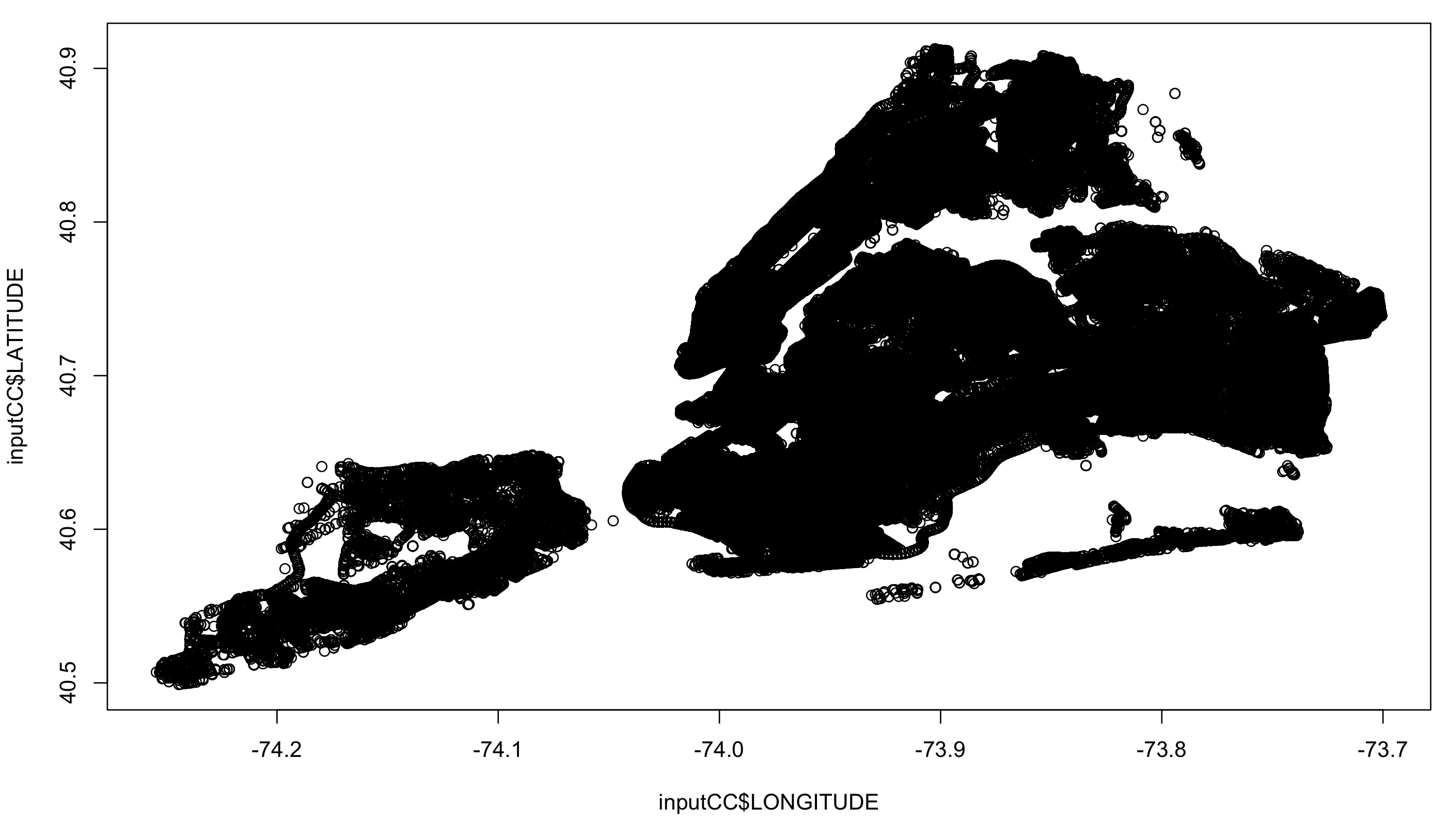
The dataset here for consideration had 769050 records for collision information from the July 2012 to March 2016. As the location information is paramount for our analysis, as part of pre-processing, all records with missing location information were removed. As part of my analysis I am trying to understand if there are any collision prone areas, which stand out and the best way to understand this is to visualize them. Figure 1 shows the simple plot of all the collision records. The plot indicates their have
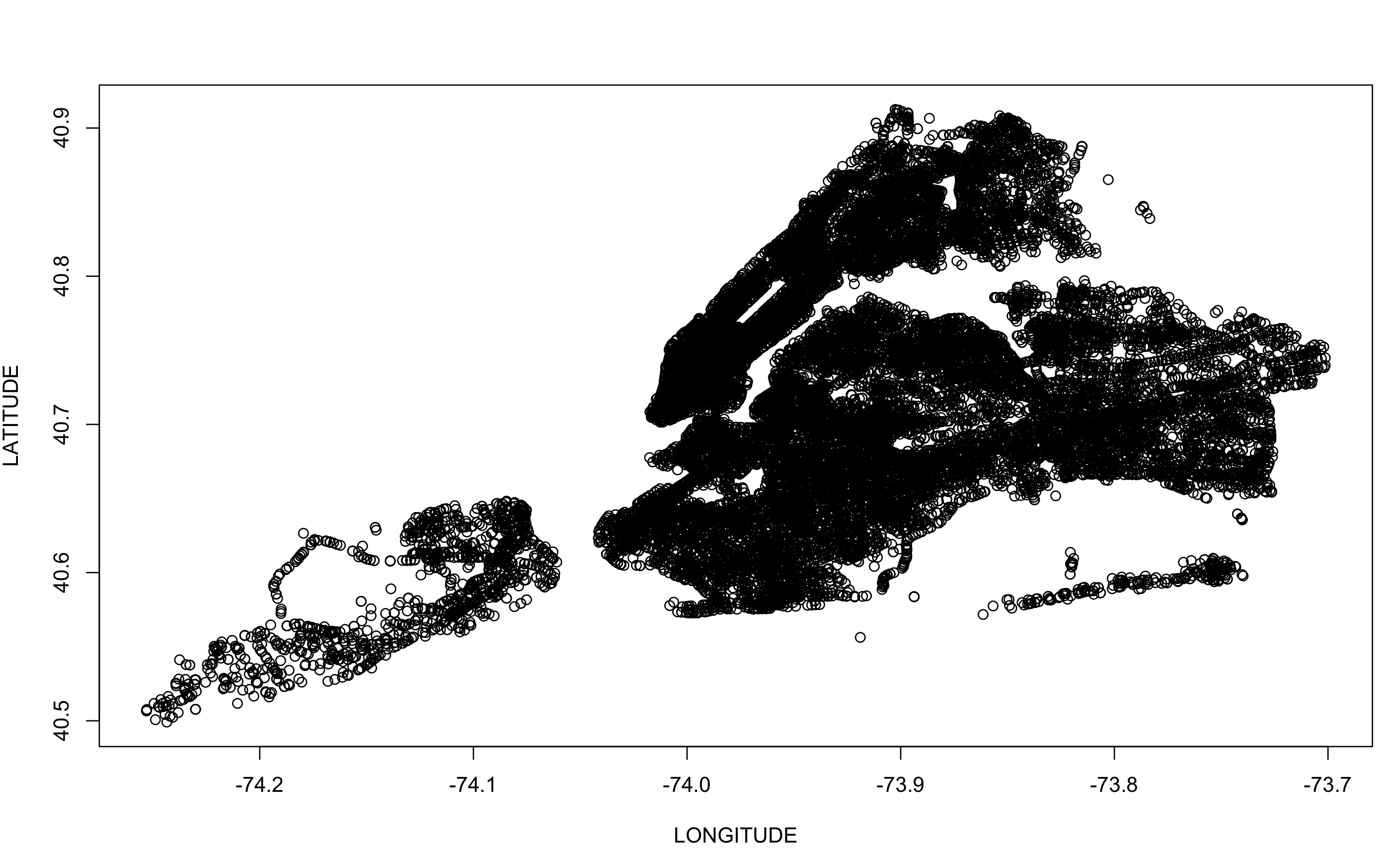
been vehicle collisions in almost every intersection possible and this will not give us much information about the details about collision prone locations. Figure 2 shows a plot of Vehicle collisions only in the Year 2015 (182845 records) but still the collision prone information doesn’t entirely pop out.

been vehicle collisions in almost every intersection possible and this will not give us much information about the details about collision prone locations. Figure 2 shows a plot of Vehicle collisions only in the Year 2015 (182845 records) but still the collision prone information doesn’t entirely pop out.

Assuming that the collision prone areas will have more collision’s reported and concentrated over an intersection or maybe a couple of blocks. Thus there should many such underlying groups within our data and data mining them out will give us better insights. I will be using Clustering approach to identify these groups (if any) within the data. The clustering approaches that I am going to uses are kmeans, Agglomerative clustering and DBSCAN. The following sections give more information on the details of these clustering methods and the results after their implementation in R. 
K Means Clustering
In K-means[20] we will try to partition current vehicle collision data in k clusters and then try to understand the nature of these clusters formed. However before we start we need to identify the ‘k’. For choosing the best ‘k’ we can need to try all values of ‘k’ and choose the ‘k’ with the lowest SSE (Sum of Squared Errors). I have chosen the kmeans library[21] in R to perform the kmeans clustering. This library uses the number of centers or K value and uses a random start as seed points and uses a default number of iterations on it.
Figure 3 shows the results of the plotting the SSE values for clusters from 2 to 15. We can clearly identify that the inflection point is at or around the values of cluster k = 4, however from my previous experience in the implementation of k- means, the next value to the inflection points usually provides a better estimate. As for my analysis I have visualized the data for both these results and they share a common results.
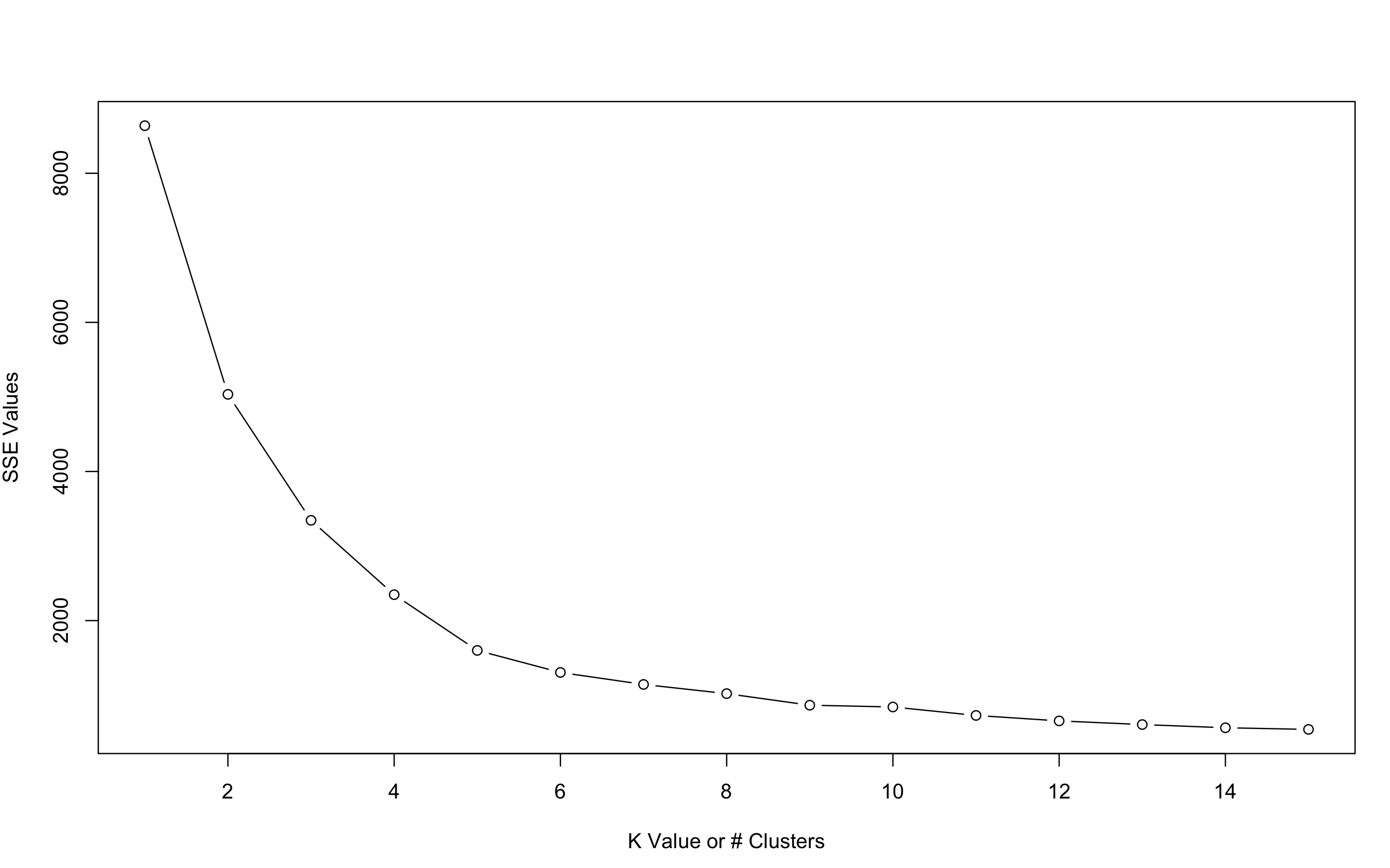 
Figure 4 : Plotting K v/s SSE for clusters from K = 2 to15

Figure 4 : Plotting K v/s SSE for clusters from K = 2 to15
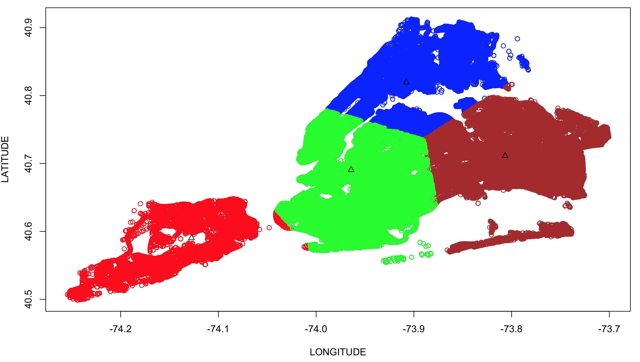 
Figure 5 : K Means Clustering Results For 4 Clusters

Figure 5 : K Means Clustering Results For 4 Clusters
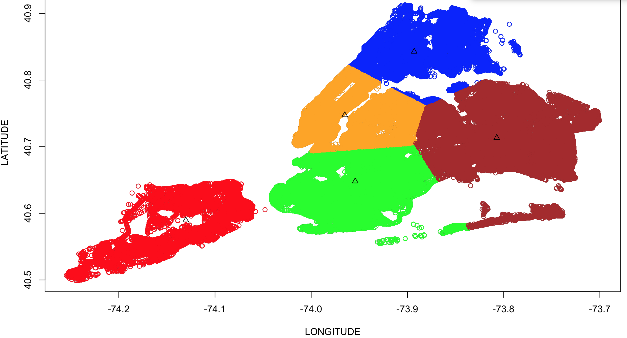 
Figure 6 : Kmeans clustering results for 5 clusters

Figure 6 : Kmeans clustering results for 5 clusters
Figure 4 & 5 shows the visualizations for the k=4 & k=5 clusters respectively, represented in different color. The black triangles mark the center of these clusters and cluster sizes provide interesting details. The clusters that are formed around the Manhattan and Brooklyn areas have larger cluster sizes compared to area they represent. In case of K = 4 these individual clusters of sizes 108095(Manhattan) and 202149(Brooklyn) are merged in to a single cluster of size 310827. Table 2 : Kmeans Cluster Sizes for K=4 and K =5 values
| Cluster | Cluster Sizes (k = 4) | Cluster Sizes (k=5) |
|---|---|---|
| 1 | 32643 | 31698 |
| 2 | 165068 | 108095 |
| 3 | 139327 | 165411 |
| 4 | 310827 | 202149 |
| 5 | - | 140512 |
These numbers complemented by the visualization enlighten us with the information that a significant number of the collisions are concentrated in the areas of Manhattan and Brooklyn.
Agglomerative Clustering
Agglomerative Clustering[22] is the bottom up version Hierarchical clustering where each data point starts as its individual cluster and at every iteration we merge the ones, which are closest to each other into new cluster. I used the hclust[23] library in R to perform agglomerative clustering on a subset of our data set and where we are using the wards methods to perform this. To start this first I computed the distance matrix
using dist()[24] library in R and then ran hclust on it. We then plotted the results of the dendogram that are shows below in Figure 6
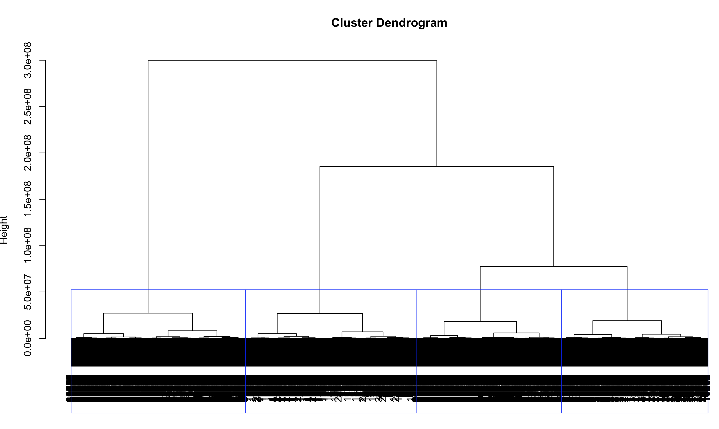 

Figure 7 : Agglomerative Clustering using hclust[23]
The guiding line (in red color) gives information about the clusters that exist in our data set and the 3rd and the 4th clusters (from left to right) represent the information or data points belonging to the borough’s Manhattan and Brooklyn. This is similar to our observation in k-means about Manhattan and Brooklyn being more collision prone.
DBSCAN Clustering
DBSCAN[18] clustering provides clusters based on groups of data points that are nearest to each other . It works on the concept of categorizing core points, border points and seed points where all points within the EPS of each other are categorized as core
and they satisfy the MINPTS condition, while the ones outside EPS are categorized as noise points. I used the dbscan[25] package in R to give the density based clusters in our data. I faced quite a bit of snags with running this package due to the size of the dataset. Reducing the size of the data set and selecting an appropriate EPS and MINPTS was challenge and was finally after quite a bit of iterations I was able to provide below visualization. The EPS chosen here was 0.05 and MINPTS was increased to 20 from its default value of 5.
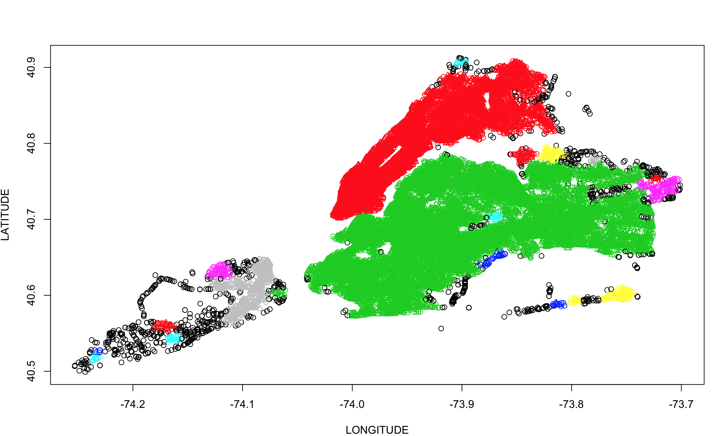 
Figure 8 : DBCAN Visualization for 2016 Dataset. Data from NYC Open Data[2]

Figure 8 : DBCAN Visualization for 2016 Dataset. Data from NYC Open Data[2]
Figure 7 gives additional clusters compared to the results of previous clustering algorithms however it provides higher density clusters over Manhattan and Brooklyn thus aligning to our findings related to previous clusters. 
Results
The above clustering methods point to the two most collision prone areas that lie within the boroughs of Manhattan and Brooklyn. This could be also because they might have more intersections than compared to other Boroughs. I will be focusing on these two boroughs and will visualize the information on the persons killed and injured and try to find the most dangerous intersections. Below are the various insights I was able to provide based on the features available in the dataset.
Heat Maps
Heat Maps provide clear insight of the density of collisions in particular areas. Figure 8 shows a quick plot of the yearly collision data plotted on Google maps, which doesn’t provide much information as we have enough records to cover the entire NYC map.
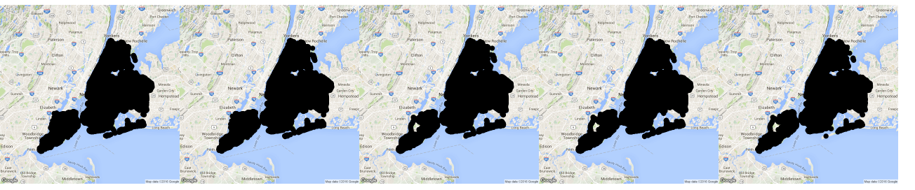 
Figure 9 : Vehicle Collision Data NYC : 2012 - 2016(left to right). Data from NYC Open Data[2]

Figure 9 : Vehicle Collision Data NYC : 2012 - 2016(left to right). Data from NYC Open Data[2]
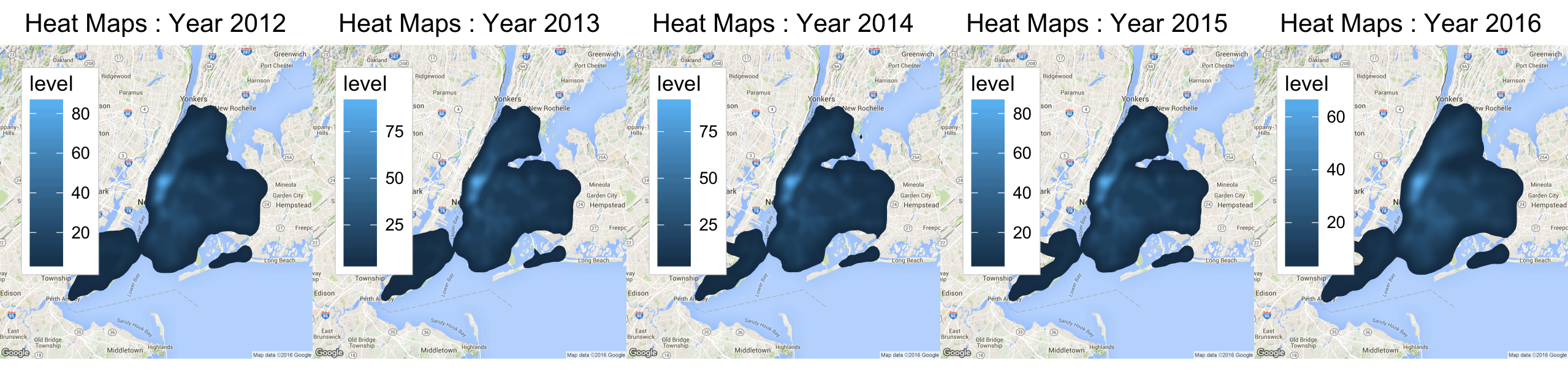 
Figure 10 : Heat Maps for Vehicle Collision in NYC : 2012 -2016 . Data from NYC Open Data[2]

Figure 10 : Heat Maps for Vehicle Collision in NYC : 2012 -2016 . Data from NYC Open Data[2]
Figure 9 gives the information of the density of collisions across all years. It can be easily observed how the areas of Manhattan and Brooklyn show higher densities year on year. Figure 10 below gives a better insight about the collisions in Manhattan in 2015.
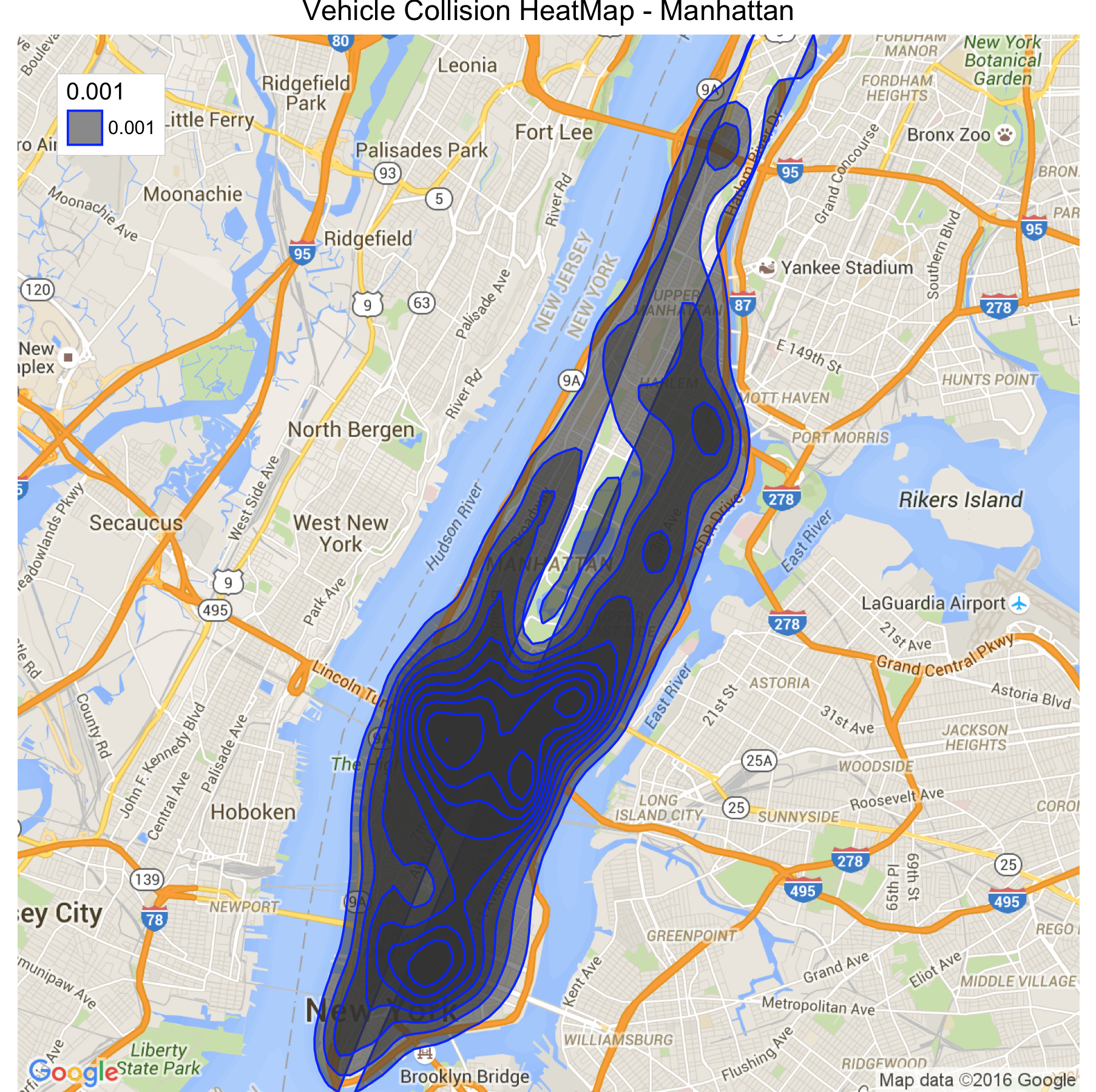 
Figure 11 : Vehicle Collision For Year 2015. Data from NYC Open Data[2]

Figure 11 : Vehicle Collision For Year 2015. Data from NYC Open Data[2]
In Figure 10 we can see the areas of Manhattan and Brooklyn consists of areas with high density collisions, with Manhattan having certain areas with collision density as high as 80. Figure 11 gives a similar heat map for the areas of the Brooklyn. A closer look at both the heat maps reveal some important information about the nature of collisions. In both the maps the collisions are heavily concentrated to the points where bridges and freeways get connected. This can be seen in the maps around the Lincoln
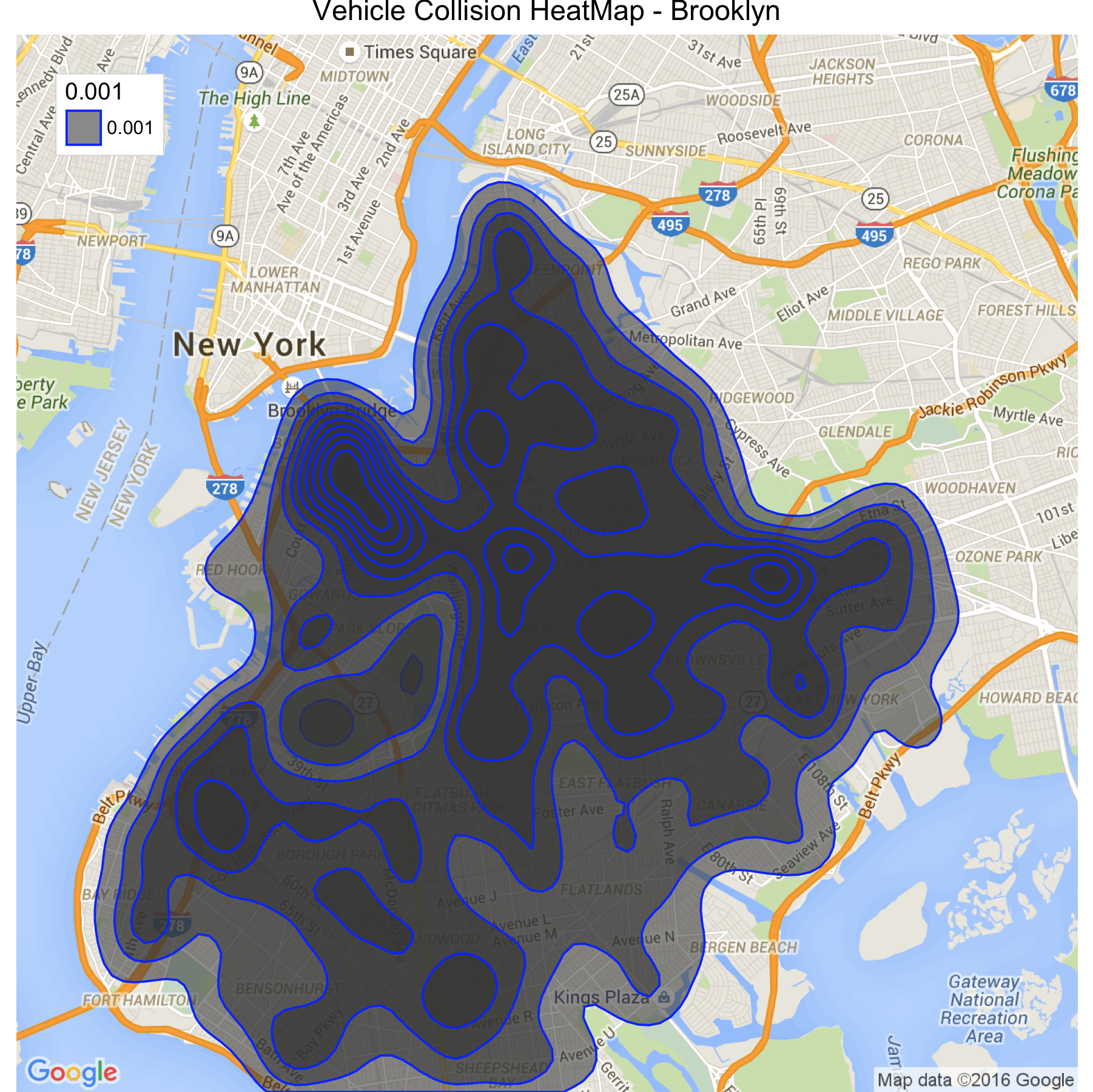 Figure 12 : Vehicle Collision : Brooklyn Year 2015. Data from NYC Open Data[2]
Tunnel or near Brooklyn Bridge. These areas have strict speed limit restrictions and appropriate slow zones, hence it would be more interesting to see how speed is a factor in these collisions.
Fatality
The dataset provides us with features such as the persons killed and what where the reasons for the collisions. Visualization below tries to correlate these two factors and we get some interesting observations. A close look at Figure 12 indicates more fatalities have occurred due to disregard to traffic control or drivers inattention/distraction.
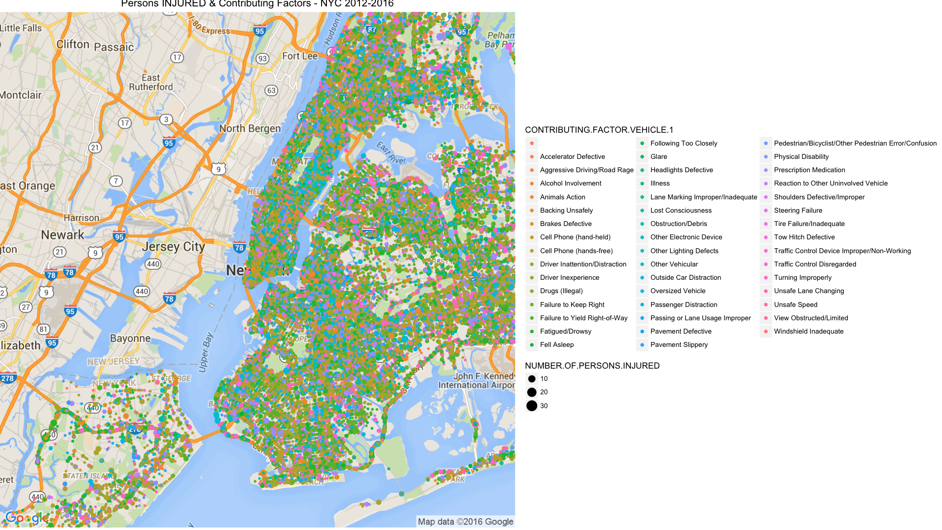 Figure 13 : Person Killed & Contributing Factors : NYC 2012-2016
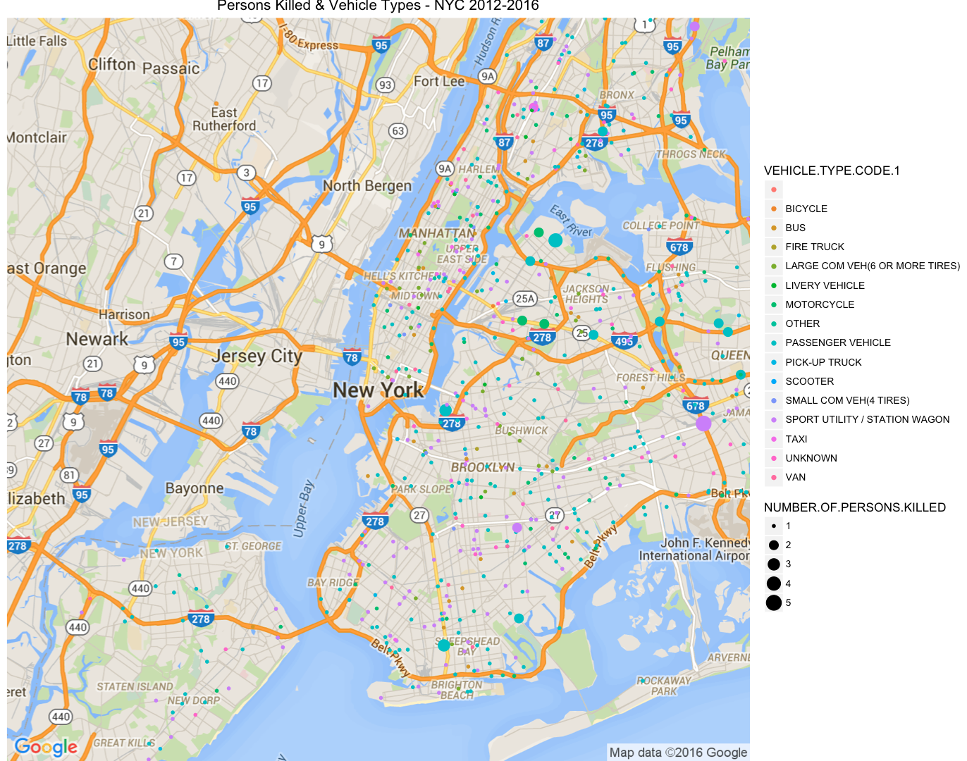 Figure 14 : Persons Killed and Contributing Vehicle Type
Also we do have another feature informing the type of vehicle involved in the crash. Figure 13 gives a similar visualization, alluding that the passenger vehicles are significantly more involved in such vehicle collisions. This conflicts with the cognitive bias that New Yorker’s have about rash Taxi drivers.
Injury
There are more contributing factors when we consider a similar correlation to the persons that were injured during vehicle collisions. Figure 14 below points out the major contributing factors in collisions where persons were injured.
Figure 15 : Persons Injured and Major Contributing Factors

A close look at the major contributing factors and their resulting injuries caused, it indicates most of them were tagged under Driver Inexperience or Driver Inattention/Distraction. NYC has a new program called Vision Zero, where they are trying to eliminate the vehicle collisions by providing better infrastructure and well designed intersections. However the flaw in this approach is that, one of the major contributing factors mentioned above might still exist, unless they have a plan of adding self driven cars.
There were around 227 incidents in the dataset where the collision vehicle type involved Ambulances. The information regarding the contributing factor was listed as “Unspecified” for most of these; also the data set was quite small to provide any exciting pattern about it.
Most Dangerous Intersections
Utilizing the Year on Year Data since 2012 – 2016, I was able to map the streets with the most collisions reported. The dataset provides information of ON.STREET.NAME and CROSSS.STREET.NAME, which indicates the street and the immediate cross street at the nearest intersection. Using the above two features I was able to find the intersections with the most number of collisions. In case there are any collisions between 2 intersections this collision information was mapped to the nearest one. Figure 15 shows the visualization for the Most Dangerous Intersections.
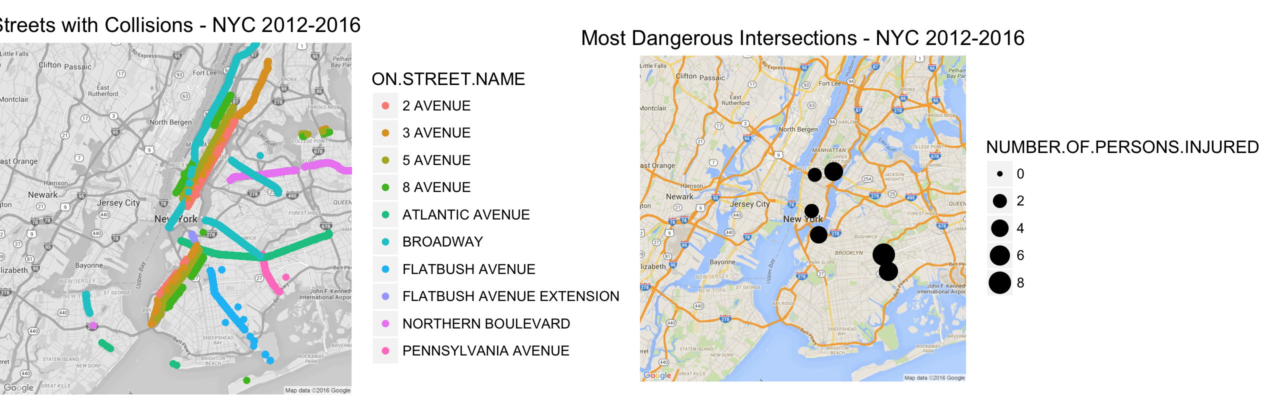 Figure 16 : Most Dangerous Intersections.
Table 2 : Number of Collisions at the Most Dangerous Intersections
| On Street Name | Cross Street Name | Number of Collisions |
|---|---|---|
| Flatblush Avenue Extension | Tillary Street | 585 |
| East 59 Street | 2 Avenue | 472 |
| West 42 Street | 8 Avenue | 455 |
| Pennsylvania Avenue | Atlantic Avenue | 433 |
| Pennsylvania Avenue | Linden Boulevard | 417 |
Most of the streets above are high congestion areas as they serve as access points to bridges and connecting freeways. The amount of collisions and the contributing factors indicate heavy traffic can be a reason and major infrastructure changes to add alternated freeways to bypass these intersections might prove useful.
Vision Zero Promises
The Vision Zero [9] initiative claims that it has reduced the number of fatalities and deaths have declined first time after 1910. Performing all the above analysis for every year (2012 – 2015) dataset lets evaluate the claims made by the Vision Zero program.
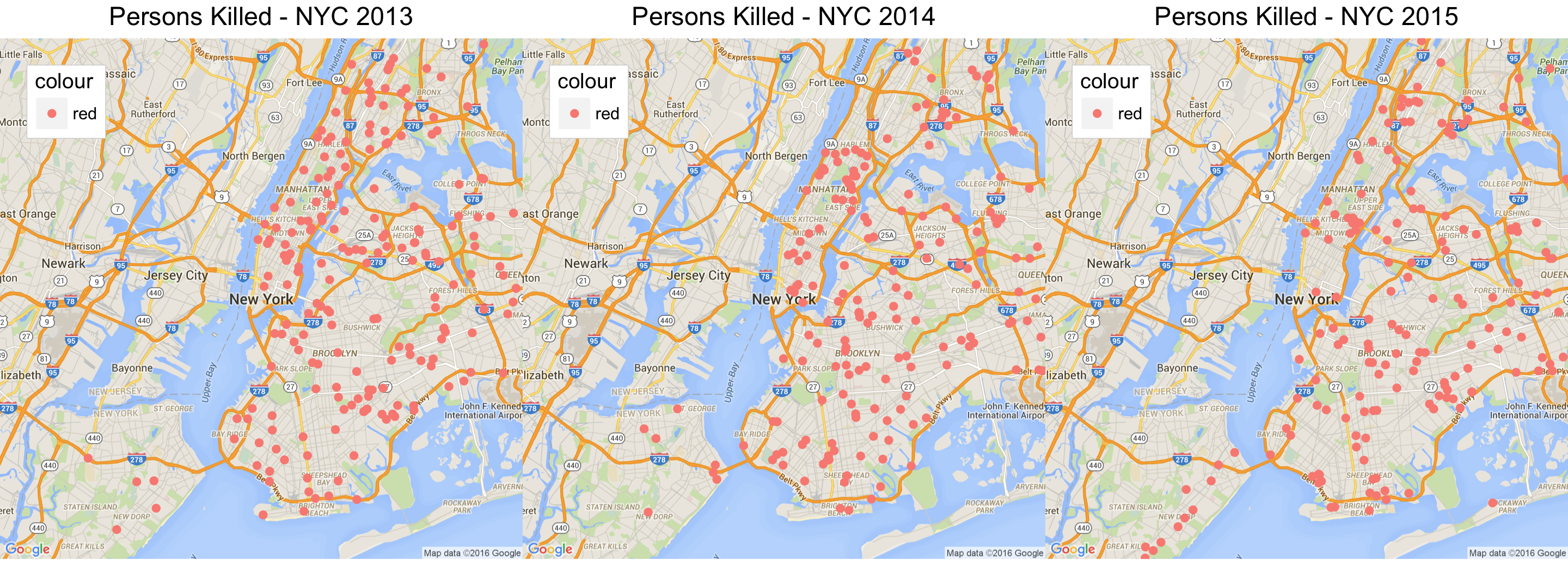 Figure 17 : Persons Killed Every Year 2013-2015
Vision Zero Program reports[27] that the fatalities have significantly reduced, but the visualization above indicates a reduction but it is not significant. Vision Zero talked about the achievement in not having any increased fatalities related to Cyclists, however visualization in Figure 16 shows the data off all the Cyclists that were killed, and it doesn’t show any significant progress. Also the pedestrians that were killed over the past three years due to vehicle collisions have been steady and there is definitely not much improvement. NYC Administration has recognized this and in there Vision Zero 2015[27] review and decided to install LPI’s (Leading Pedestrian Intervals) in streets, which provide visibility of the pedestrians at intersections.
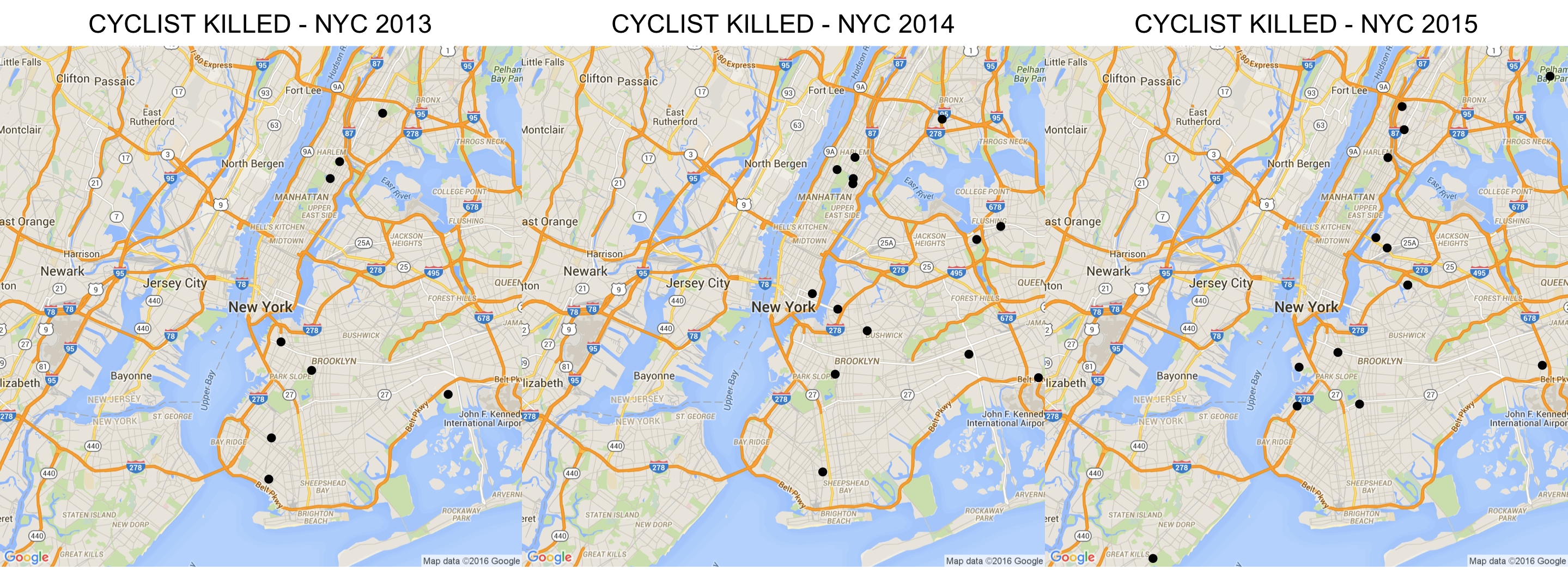 Figure 18 : Cyclist Killed due to Vehicle Collision in NYC 2012-2015
More Observations
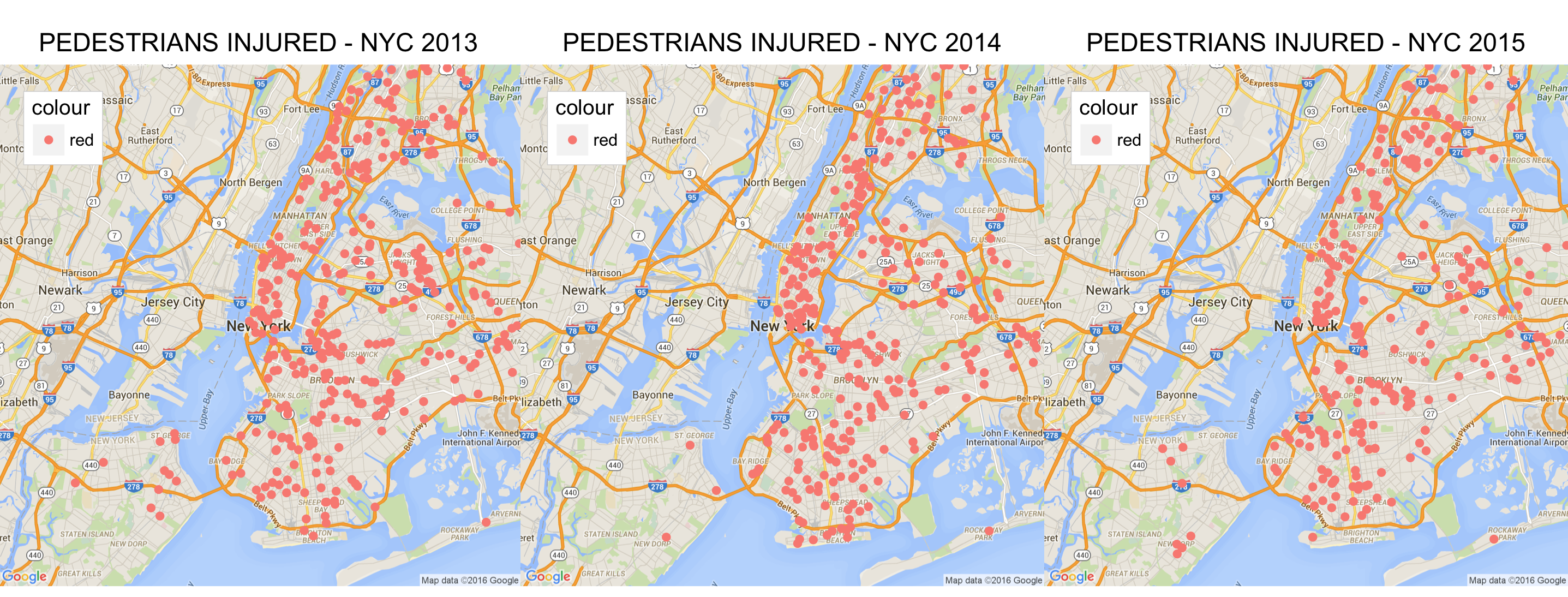 Figure 19 : Pedestrians Injured Every Year 2013-2015
Apart from all the observations mentioned above, there are few more that can be derived from the above analysis. As most of the collision information is associated to the intersections, there might be possibility that Manhattan and Brooklyn have more intersections compared to the other boroughs and hence resulting in more vehicle collisions and thus a much dense cluster around these Boroughs. I was however unable to find or evaluate the number of intersections in each borough. If this information was available, a direct correlation between the numbers of intersections in a Borough to the collisions over time within the same borough might provide some interesting information. Also the Contributing factors for most of the collisions were not primarily “Unsafe Speed”, which usually comes under top priority whenever traffic fatalities are discussed and every administration implements “slowdown” zones. It points to the clear indication that just enforcing “slow zones” will not be the silver bullet to solve the problem. The number of Pedestrian deaths and injuries has either been steady or has increased. This might not be just due to fault of the vehicles, but also jaywalking pedestrians. I have personally observed fellows texting while walking into the traffic, which might require the administration to have stricter jaywalking laws and emphasize that they are followed.
Future Work
Data Mining gives us insights about data the usually don’t pop out and enable us to make data driven decisions on the basis of this information. Vision Zero [9] by NYC De Blasio Administration Is one such implementation and a real life example of digital governance. The findings of this analysis could be used to check the effectiveness of the safety measures adopted under Vision Zero. I could provide feedback to the program on statistically what they have done right and what is probably not working. Another interesting application which would be targeted to jaywalkers informing them that they are in a pedestrian kill zone and should pay attention on the road rather than texting through the traffic. This information would be embedded in the texting app which the users use and will provide this information in real-time using location as the context for the same.
Conclusion
The experience was pretty good, also very beneficial as my next visit to NYC, as I would be passively validating my analysis. I took up a clustering problem as I already performed some classification in my previous course and also I was then unable to relate to practical applications of clustering. Through this course and in this project I was finally able tried to provide insights over a problem, which even the NYC administration is relying on data to solve. Vehicle Collisions in NYC have been regular and as per my analysis just including slow zones within collision areas will not be a better solutions. There has to be a major reconsideration on the infrastructure level for the most dangerous intersections and a constant statistical feedback to check the effectiveness of these implementations should be in place to reduce the traffic related fatalities.
References
[1] Open Data Plan
[2] NYC Open Data Portal for Vehicle Collision Information
[4] Motor vehicle crash pedestrian deaths in New York City: The plight of the older pedestrian
[7] Google Maps and Earth Help Forum
[8] Google Products Forum (Maps)
[10] Citywide Open Data Policy
[11] Ben Wellington’s Ted Talk
[13] De Blasio Signs Open Data Legislation
[14] NYC Open Data Law to Solve Problems
[19] Visualization of NYC Collision Data using R.
[20] K means clustering
[21] kmeans library : R Documentation
[26] DBSCAN Package in R
[27] Vision Zero 2015 Review Report
[28] Stat Density 2d
[29] Geom Points